In the world of genome-wide association studies (GWAS), we often get a list of genetic markers (SNPs) that seem for some reason relevant for a particular outcome. At the same time, we have little knowledge about these genetic variants that come in cryptic combinations of characters and numbers.
For example:
- We might get asked how frequent the SNP
rs1421085is in a range of populations. - We need to extract all known SNPs that are within 1 Mb of
rs1421085. - A genomic region turns out to be highly relevant for some disease, and we want to know all genes contained in that genomic region.
Unless you sit on lots of genetic data, the list of SNPs come from a summarised form. Minimally, these summary statistic datasets contain the SNP identifier (SNPNAME), the effect size (beta) and the standard error (se). Sometimes the position (POS) and chromosome (CHR) is provided instead of the SNP identifier, and sometimes both are available. Then there is usually other information coming from the study data; for example, the allele frequency in the study this is shown on the LHS in the table below. However, hardly ever do the datasets contain annotation, such as the gene where the SNP resides, the phenotypes it is associated with or the minor allele frequency (MAF) in a specific population this is illustrated in the green coloured part in the table below.
| CHR | POS | SNPNAME | REF | ALT | beta | se | Gene | Linked phenotype | Global MAF |
|---|---|---|---|---|---|---|---|---|---|
| 7 | 75163169 | rs1167827 | A | G | 0.028 | 0.0032 | HIP1 | BMI | 0.4720450 |
| 12 | 122781897 | rs11057405 | G | A | -0.021 | 0.0037 | CLIP1 | BMI | 0.0327476 |
| 10 | 114758349 | rs7903146 | C | T | -0.031 | 0.0023 | TCF7L2 | BMI | 0.2278350 |
| 1 | 49589847 | rs657452 | A | G | -0.015 | 0.0025 | AGBL4 | BMI | 0.4532750 |
| 1 | 49589847 | rs657452 | A | G | -0.015 | 0.0025 | AC099788.1 | BMI | 0.4532750 |
This makes sense. Genetic data from cohorts will be used for years and won’t change, but the annotation will change over the years. Take the chromosomal position of SNPs that changes with every new human genome reference assembly.
To get our hands on annotation, we need to consult external databases that are - lucky us! - public. But first, let us define what we want to see at the end of the blog post.
Goal
For this blog post, we keep it simple and only focus on the genes contained in a genomic region, but this can be easily extended to any other annotation available in databases.
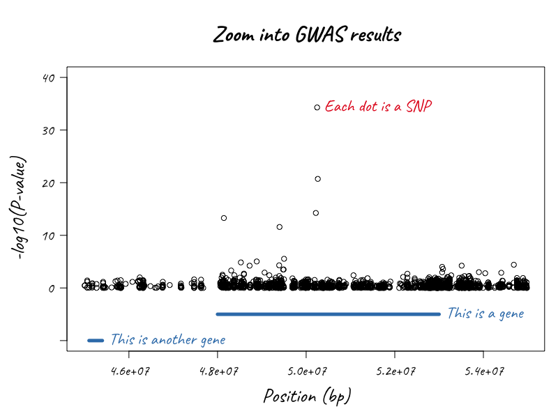
In the illustration below1, we want to know the gene starting and end positions around one particular gene region to create an informative locuszoom plot.
Getting it done
There are currently more than 10 Mio SNPs known, and knowing their functions and genes by heart would equal to some superpower. Which is why we 2 public databases, such as dbSNP and ensembl3.
What we like even more, is, to make our analyses reproducible and automate annotation and lookups.
In this blog post, I will show how to zoom into GWAS results and annotate the plot based on the information about that genomic region using R.
Here is the plan:
Before tackling the first item, we want to have all R-packages installed & ready to use:
## Packages needed to run code
## ----------------------------
# install.packages("dplyr")     ## data manipulation
# install.packages("data.table") ## read data, fast!
# install.packages("forcats")   ## dealing with factors
# install.packages("ggplot2")   ## dataviz
# install.packages("magrittr")  ## piping
# install.packages("metafolio")  ## colorpalette
# install.packages("skimr")     ## summarising data
# install.packages("qqman")     ## Manhattan plot
# install.packages("patchwork") ## assembling plots

# source("https://bioconductor.org/biocLite.R")
# biocLite("biomaRt")           ## annotation

## Optional packages for Rmd
## --------------------------
# install.packages("kableExtra") ## making pretty tables
# install.packages("devtools")
# devtools::install_github("hadley/emo")        ## emojis
# devtools::install_github("ropenscilabs/icon") ## icons
1. Get summary statistics
First, we need some GWAS summary statistics.
There are lots of resources for publicly available GWAS summary statistics.
We will look at BMI, because it can be accessed easily4 and because it is relatively small for a genomic dataset. The data is from the Genetic Investigation of ANthropometric Traits (GIANT) consortium. You can download the dataset5 here or load it directly into R.
## Data Source URL
url <- "https://portals.broadinstitute.org/collaboration/giant/images/2/21/BMI_All_ancestry.fmt.gzip"

#url <- "jenger.riken.jp/1analysisresult_qtl_download/All_2017_BMI_BBJ_autosome.txt.gz"

## Import BMI summary statistics dat.bmi <- read_tsv(file = url) ##
## taking too long, let's use fread instead.

dat.bmi <- data.table::fread(url, verbose = FALSE)
I added verbose = FALSE because it will complain that there is an unexpected character in column 1, which appears to be numerical. This is because chromosome X will only appear towards the end of the dataset.
Next, we rename some columns to something more conventional.
## Rename some columns
dat.bmi <- dat.bmi %>% rename(SNP = SNPNAME, P = Pvalue)
Now, let’s look at the data with the skimr package.
skimr::skim(dat.bmi)## Skim summary statistics
## n obs: 246328
## n variables: 10
##
## ── Variable type:character ──────────────────────────────────────────────────────────────────────────────────
## variable missing complete n min max empty n_unique
## ALT 0 246328 246328 1 1 0 4
## CHR 0 246328 246328 1 2 0 23
## ExAC_MAF 0 246328 246328 1 325 0 51423
## GMAF 0 246328 246328 1 17 0 9964
## REF 0 246328 246328 1 1 0 4
## SNP 0 246328 246328 1 11 0 243206
##
## ── Variable type:integer ────────────────────────────────────────────────────────────────────────────────────
## variable missing complete n mean sd p0 p25 p50
## POS 0 246328 246328 7.6e+07 5.7e+07 11885 3.2e+07 6.1e+07
## p75 p100 hist
## 1.1e+08 2.5e+08 ▇▇▅▅▃▂▁▁
##
## ── Variable type:numeric ────────────────────────────────────────────────────────────────────────────────────
## variable missing complete n mean sd p0 p25
## beta 977 245351 246328 0.00051 0.13 -3.2 -0.032
## P 977 245351 246328 0.48 0.3 8.6e-269 0.21
## se 0 246328 246328 Inf NaN 0.002 0.023
## p50 p75 p100 hist
## -0.00017 0.031 3.2 ▁▁▁▇▇▁▁▁
## 0.47 0.73 1 ▇▇▆▆▆▆▆▆
## 0.059 0.11 Inf ▇▁▁▁▁▁▁▁The reference allele (REF), alternative allele (ALT), SNP identifier (SNP) and chromosome (CHR) are characters. There are four unique values for ALT and REF: A, C, G, T, and 23 unique values for CHR - seems about right. The two columns with the minor allele frequencies measured in GIANT and ExAC datasets (GMAF, ExAC_MAF) are characters too because the allele is concatenated. The chromosomal position (POS) is an integer. Then there is the actual association of each SNP with BMI (beta, se, P).
This dataset has 246328 rows and 10 columns. What if we want to visualise this all at once? In particular, we are interested if there are ANY associations between the genetic markers and BMI. The mini P distribution in the skimr output does not reveal much.
Visualising associations
Visualising all associations at once can be done with a Manhattan plot, where the x-axis represents chromosomeCHR and the chromosomal position POS, and the y-axis the -log10(P)-value. Let’s use the R-package qqman6 for that.
qqman::manhattan(dat.bmi %>% mutate(CHR = as.numeric(as.character(fct_recode(CHR, "23" = "X")))) %>% filter(-log10(P)>1), chr="CHR", bp="POS", snp="SNP", p="P", suggestiveline =FALSE, genomewideline = FALSE, chrlabs = c(1:22, "X"), cex = 0.4)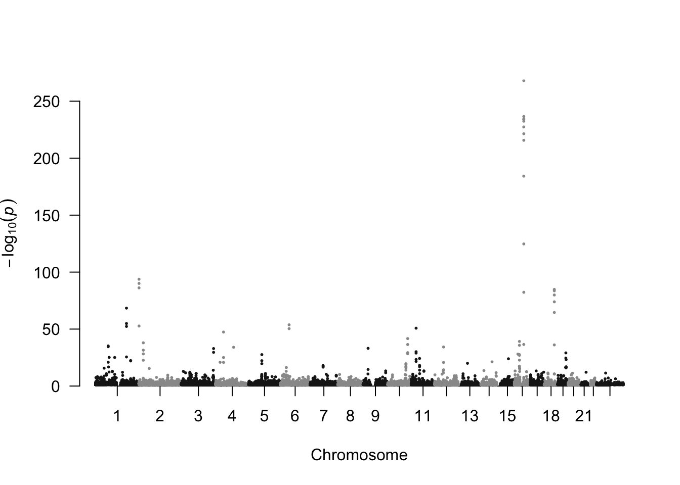
We can spot immediately, that there are loads of SNPs with P-values smaller than \(10^{-100}\) (sample size was around 700K).
Of course, there are many other solutions to spot real associations, but this is not the point of this blog post ;-).
Identify genomic region with lowest P-value
Now that we know that there are lots of genetic markers associated with BMI, we want to look at a specific genomic region and figure out what genes it contains. For illustrative purposes, we pick the genomic region with the lowest P-value.
dat.bmi.sel <- dat.bmi %>% slice(which.min(P))
dat.bmi.sel
## CHR POS REF ALT SNP GMAF ExAC_MAF beta se P
## 1 16 53800954 T C rs1421085 C:0.2286 - 0.078 0.0022 8.6e-269SNP identifier rs1421085 that has the lowest P-value (\(P = 8.6\times 10^{-269}\)).
Now we can visualise the summary statistics of that genomic region (\(\pm 500 \cdot 10^{3}\)).
range <- 5e+05
sel.chr <- dat.bmi.sel$CHR
sel.pos <- dat.bmi.sel$POS

dat.bmi.sel.region <- dat.bmi %>% filter(CHR == sel.chr, between(POS, sel.pos -
      range, sel.pos + range))
p1 <- ggplot(data = dat.bmi.sel.region) +
geom_point(aes(POS, -log10(P)), shape = 1) +
labs(title = "Locuszoomplot for BMI GWAS", subtitle = paste("Summary statistics for chromosome", sel.chr, "from", format((sel.pos - range), big.mark = "'"), "to", format((sel.pos + range), big.mark = "'"), "bp"), caption = paste("Data source:", url))
print(p1)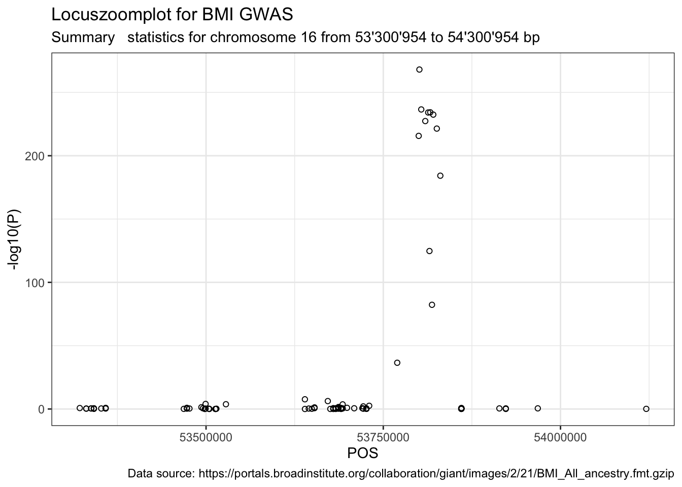
Next, we want to know if rs1421085 is part of a gene, and if yes, which one.
2. Extracting annotation
biomaRt
Thankfully, there is an R-package called biomaRt that can do this for us.
I had only come across this package a few weeks ago, so I apologise in advance that I won’t make full use of all the features that the package offers.
biomaRt should not be confused with biomartr. biomartr is an rOpenSci package by Hajk-Georg Drost. I needed this tweet to realise that these were two separate yet related R-packages.
Did you ever want to reproducibly retrieve thousands of genomes across the tree of life using only one R command? Then have a look at the new version of biomartr which is on its way to CRAN! https://t.co/kWF5XCoGhj #bioinformatics #rstats #Genomics pic.twitter.com/EZHJP0n1f9
— Hajk-Georg Drost (@HajkDrost) June 28, 2018
So far, I did not fully grasp the benefits of biomartr compared to biomaRt for annotation of human data. But I will look more into it.
I also got a tip from Marianna Foos to check out rsnps, an R-package dealing with SNP annotation.
Learning resources
I used mainly two sources to learn what I wanted to do:
- Vignette of biomaRt on Bioconductor7.
- This question on StackOverflow.
Using biomaRt
First, we need to load the biomaRt package from Bioconductor.
library(biomaRt) Next, we specify which database to use. You can use the functions listMart(), listEnsembl() and listDatasets() to select from the right biomart and dataset. We will need to extract SNPs, hence biomart = "snp".
snp.ensembl <- useEnsembl(biomart = "snp", dataset = "hsapiens_snp")

class(snp.ensembl)
## [1] "Mart"
## attr(,"package")
## [1] "biomaRt"# other ways of selecting the mart snp.mart <- useMart(biomart =
# 'ENSEMBL_MART_SNP', dataset='hsapiens_snp')
# gene.mart <- useMart('ensembl', dataset='hsapiens_gene_ensembl')Last, we extract the gene id to which our SNP belongs using the function getBM(). Along with that, we also extract other information, like the minor allele frequency minor_allele_freq. To check which attributes and filters are available, run listAttributes(snp.ensembl) and listFilters(snp.ensembl).
out.bm <- getBM(
  attributes = c("ensembl_gene_stable_id",
                 "refsnp_id",
                 "chr_name",
                 "chrom_start",
                 "chrom_end",
                 "minor_allele",
                 "minor_allele_freq"),
                # "ensembl_transcript_stable_id",
                # "consequence_type_tv"),
  filters = "snp_filter",
  values = "rs1421085",#dat.bmi.sel$SNP,
  mart = snp.ensembl)
This gives us - as chosen in attributes - the gene identifier, the SNP identifier, the chromosome name, chromosomal position (start + end), minor allele and minor allele frequency. The output in out.bm corresponds to this webpage entry on the ensembl webpage.
out.bm## ensembl_gene_stable_id refsnp_id chr_name chrom_start chrom_end
## 1 ENSG00000140718 rs1421085 16 53767042 53767042
## minor_allele minor_allele_freq
## 1 C 0.228634Quick d-tour: assembly GRCh37 or GRCh38?
Before getting the gene names, we want to check if the positions in the dataset are from assembly GRCh37 or GRCh38. This is a handy thing because often only SNP identifiers are reported. Or SNP identifiers are reported, but with positions on a different assembly.
ifelse(sel.pos == out.bm$chrom_start,
       "\u2713: same assembley (GRCh38)",
       "\u2717: not the same assembley")
## [1] "✗: not the same assembley"The position is not matching, because the databases that we are looking at is based on the most recent human assembly GRCh38, but the BMI summary statistics dataset is based on human assembly GRCh37. The command listEnsemblArchives() will list you the URLs needed to get access to an archived assembly. So let’s pull out the archived GRCh37 version with the argument host = 'http://grch37.ensembl.org'.
snp.ensembl.grch37 <- useMart(host='http://grch37.ensembl.org',
                     biomart='ENSEMBL_MART_SNP',
                     dataset='hsapiens_snp')

out.bm.grch37 <- getBM(
  attributes = c('ensembl_gene_stable_id', 'refsnp_id', 'chr_name', 'chrom_start', 'chrom_end', 'minor_allele', 'minor_allele_freq'),
  filters = 'snp_filter',
  values = dat.bmi.sel$SNP,
  mart = snp.ensembl.grch37
)
out.bm.grch37
## ensembl_gene_stable_id refsnp_id chr_name chrom_start chrom_end
## 1 ENSG00000140718 rs1421085 16 53800954 53800954
## minor_allele minor_allele_freq
## 1 C 0.228634Let’s check again.
ifelse(sel.pos == out.bm.grch37$chrom_start,
       "\u2713: same assembley (grch37)",
       "\u2717: not the same assembley")
## [1] "✓: same assembley (grch37)"Flavia Hodel pointed out that adding the argument GRCh = 37 works too! That’s a handy argument (but limited to GRCh versions 37 and 38).
snp.ensembl.grch37.alt <- useEnsembl(biomart = "snp", dataset = "hsapiens_snp", GRCh = 37)


out.bm.grch37 <- getBM(
  attributes = c('ensembl_gene_stable_id', 'refsnp_id', 'chr_name', 'chrom_start', 'chrom_end', 'minor_allele', 'minor_allele_freq'),
  filters = 'snp_filter',
  values = dat.bmi.sel$SNP,
  mart = snp.ensembl.grch37.alt
)
out.bm.grch37
## ensembl_gene_stable_id refsnp_id chr_name chrom_start chrom_end
## 1 ENSG00000140718 rs1421085 16 53800954 53800954
## minor_allele minor_allele_freq
## 1 C 0.228634ifelse(sel.pos == out.bm.grch37$chrom_start,
"\u2713: same assembley (grch37)",
"\u2717: not the same assembley")## [1] "✓: same assembley (grch37)"Extracting gene name for one SNP
Next, we want to get the gene name where rs1421085 falls into.
Let’s check which attributes contain the string gene.
listAttributes(snp.ensembl) %>% slice(str_which(name, "gene")) ## name description page
## 1 associated_gene Associated gene with phenotype snp
## 2 ensembl_gene_stable_id Gene stable ID snpNow use ensembl_gene_stable_id and associated_gene as additional attributes.
## extract gene
## ----------
out.bm.snp2gene <- getBM(
  attributes = c('refsnp_id', 'allele', 'chrom_start', 'chr_name', 'ensembl_gene_stable_id'),
      filters = c('snp_filter'),
      values = dat.bmi.sel$SNP,
      mart = snp.ensembl)
out.bm.snp2gene
## refsnp_id allele chrom_start chr_name ensembl_gene_stable_id
## 1 rs1421085 T/C 53767042 16 ENSG00000140718## Attribute `associated_gene` is `Associated gene with phenotype`.
## Extract string
## ----------
gene.ensembl <- useEnsembl(biomart = "ensembl", dataset = "hsapiens_gene_ensembl", GRCh = 37) # we will need an additional mart for genes
## because we are using positions from GRCh = 37 in a next query, we need to pass that information on.
out.bm.gene <- getBM(attributes = c('external_gene_name'),
filters = c('ensembl_gene_id'),
values = unique(out.bm.snp2gene$ensembl_gene_stable_id),
mart = gene.ensembl)
out.bm.gene## external_gene_name
## 1 FTOThe gene that contains SNP rs1421085 is called FTO.
Extracting gene names for genomic region
So now we know that rs1421085 is part of FTO. But where does FTO start and end? And what are the genes nearby? For this purpose, we want to visualise the summary statistics of the full genomic region (\(\pm 250 \cdot 10^3\) Mb). We just recycle the previous code, but instead of providing a SNP-id, we provide the chromosome, the start and the end position.
out.bm.genes.region <- getBM(
  attributes = c('start_position','end_position','ensembl_gene_id','external_gene_name', 'gene_biotype'),
      filters = c('chromosome_name','start','end'),
      values = list(sel.chr, sel.pos - range, sel.pos + range),
      mart = gene.ensembl)
head(out.bm.genes.region)
## start_position end_position ensembl_gene_id external_gene_name
## 1 53088945 53363062 ENSG00000177200 CHD9
## 2 53332136 53333704 ENSG00000261056 RP11-454F8.2
## 3 53368474 53368576 ENSG00000238645 snoU13
## 4 53371365 53371483 ENSG00000202193 RNA5SP427
## 5 53395931 53397590 ENSG00000259962 RP11-44F14.4
## 6 53398894 53406995 ENSG00000260078 RP11-44F14.1
## gene_biotype
## 1 protein_coding
## 2 pseudogene
## 3 snoRNA
## 4 rRNA
## 5 pseudogene
## 6 pseudogeneWe can plot out.bm.genes.region with a line range plot, where each horizontal line represents one gene.
## rank gene names according to start position
out.bm.genes.region <- out.bm.genes.region %>% mutate(external_gene_name = fct_reorder(external_gene_name,
      start_position, .desc = TRUE))

## plot
ggplot(data = out.bm.genes.region) +
      geom_linerange(aes(x = external_gene_name, ymin = start_position, ymax = end_position)) +
  coord_flip() +
  ylab("")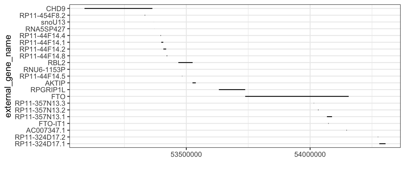
Let’s try to make that pretty. We can group the genes by gene_biotype and colour them accordingly. And we move the protein-coding genes to the top row and colour it black.
## define plot range for x-axis
plot.range <- c(min(sel.pos - range, out.bm.genes.region$start_position),
      max(sel.pos + range, out.bm.genes.region$end_position))

## rank gene_biotype label
out.bm.genes.region <- out.bm.genes.region %>% mutate(gene_biotype_fac = fct_relevel(as.factor(gene_biotype),
      "protein_coding"), external_gene_name = fct_reorder2(external_gene_name,
      start_position, gene_biotype_fac, .desc = TRUE))


## plot
p2 <- ggplot(data = out.bm.genes.region) +
  geom_linerange(aes(x = external_gene_name, ymin = start_position, ymax = end_position, colour = gene_biotype_fac, group = gene_biotype_fac)) +
  coord_flip() + ylab("") +
  ylim(plot.range) +
  geom_text(aes(x = external_gene_name, y = start_position, label = external_gene_name, colour = gene_biotype_fac), fontface = 2, alpha = I(0.7), hjust = "right", size= 2.5) +
  labs(title = "", subtitle = paste0("Genes"), caption = paste0("Data source: ", gene.ensembl@host, " + Data set: ", gene.ensembl@dataset), color = "Gene Biotype") +
  theme(axis.title.y=element_blank(),
        axis.text.y=element_blank(),
        axis.ticks.y=element_blank(),
        strip.text.y = element_text(angle = 0),
        legend.position="bottom",
        panel.grid.major.y = element_blank()) +
  expand_limits(y=c(-1, 1)) +
  scale_color_manual(values = c("black", metafolio::gg_color_hue(nlevels(out.bm.genes.region$gene_biotype_fac)-1)))
  ## hack to have 11 colors, but probably merging some gene biotype groups could make sense too.
  ## consider colorblindr::palette_OkabeIto_black
print(p2)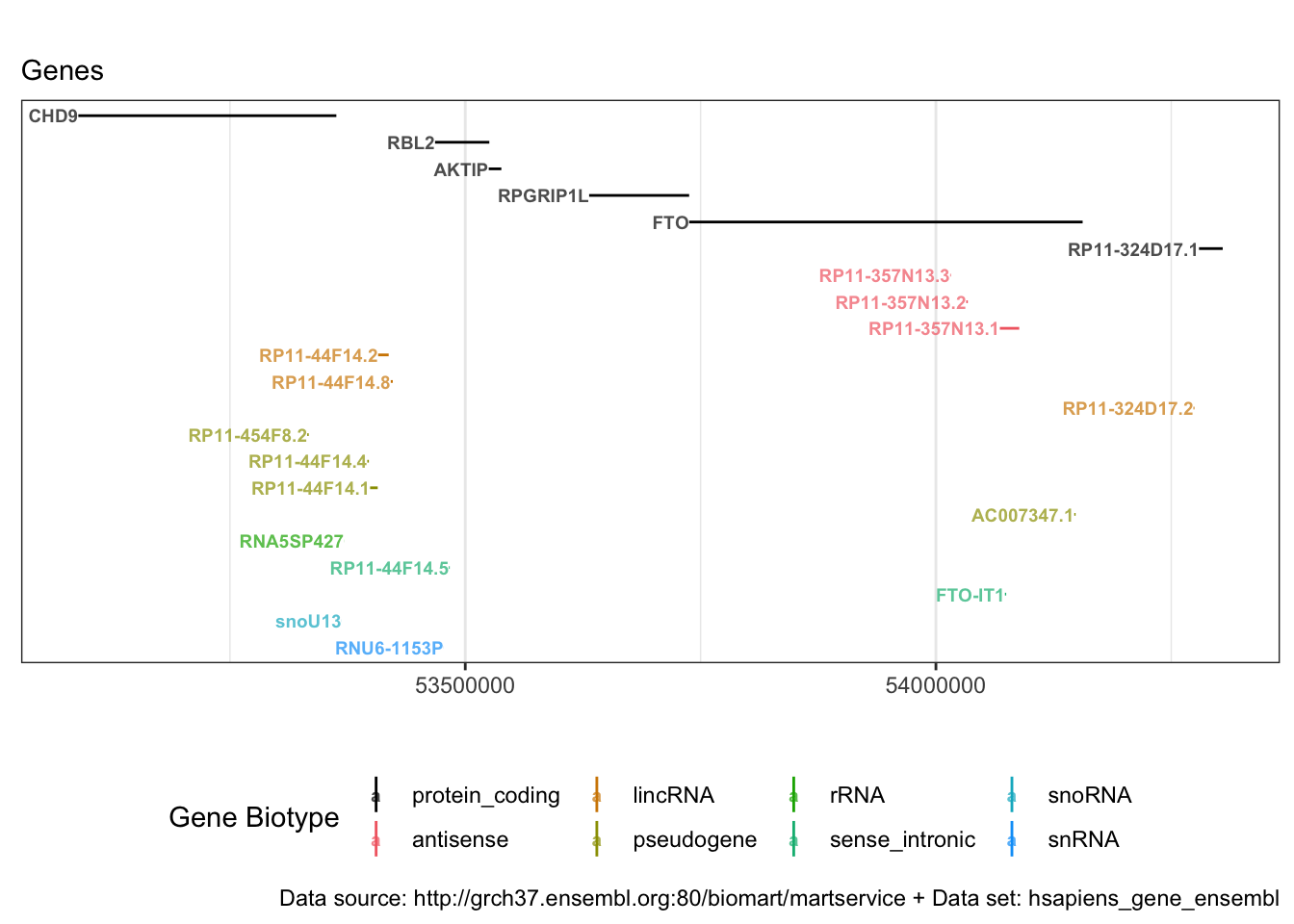
Some short genes are starting with AC and LINCO. We can check what they are and/or consult a biologist.
3. Combining summary statistics and annotation
Now we are ready to combine plot p1 and p2.
library(patchwork)

p1b <- p1 + xlab("") + theme(axis.title.x=element_blank(), axis.text.x=element_blank(), axis.ticks.x=element_blank()) + xlim(plot.range)

p1b + p2 + plot_layout(ncol = 1, heights = c(6, 6))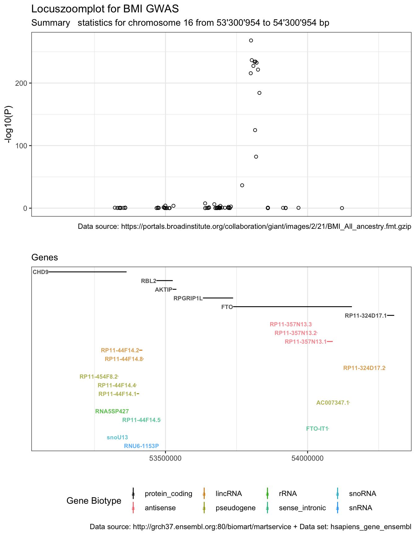
Having both plots combined, we can spot that there are six protein-coding genes in the region. But the P-value peak is located in gene FTO.
If this were work done for a real project, this would now be the time to get back to domain experts, discuss the results and figure out what other annotation they need8.
Wouldn’t it be nice…
- … to polish that plot even more? For starters, the colour code is not ideal…
- … to add information about the correlation between SNPs, like in LocusZoom plots?
- … or have an interactive plot9: hovering over the SNP points would light up the corresponding genes or give some other information, like the allele frequency.
Totally 😉 Seems like great material for future blog posts!
Source
If you know another R-package to solve a similar problem or have feedback, you can comment below 👇.
Thanks to Maëlle Salmon you get a real plot here instead of a blurry hand drawing 😉 She gave lots of feedback on my first version - much appreciated!↩
Awesome icons in R? checkout these instructions by Mitchell O’Hara-Wild on the rOpenSci webpage.↩
Thanks to my colleagues with biology background for explaining me the differences between these databases and what a biomart is!↩
Initially, I wanted to use data from two recent studies by the Psychiatric Genomics Consortium (PGC) on schizophrenia (SCZ) and bipoloar disorder (BD), as well as Major depressive disorder (MDD). Like most consortia, PGC provides summary statistics that can be downloaded. However, before downloading anything, the user needs to acknowledge and agree to a list of conditions - which I think is an excellent approach! - therefore we cannot directly load it into R.↩
Data source: Yengo et al. (2018).↩
A guide to crafting Manhattan plots by Yan Holtz for the R graph gallery↩
I recently listened to a podcast by Saskia Freytag and NJ Tierney where they talk about the differences between CRAN and Bioconductor (there are many!). The podcast is called Credibly Curious.↩
+1 for reproducibility!↩
Liza Darrous pointed out the interactive Manhattan R function manhanttanly.↩